The website is the first step of introduction of your brand to the target audience. It's your business card that forms the first impression about your company. Bad user experience caused by the user interface may ruin your reputation and they will hardly ever trust you with a business project.
A truly good website should beautifully and accurately present the information you want to your visitors to memorize about your business. To some part of the audience that has been on your site before you probably won't tell anything shockingly new. However, successful website owners are always looking for ways to improve the user experience and make the interface better to meet the growing users' demands and needs.
From time to time users who were looking for something similar to your product or services or content hit your website for the first time. And your aim is to ensure that visitors will get what they need quickly and easily. And believe our experience, website that shows poor performance won't be a good helper.
The beginning of 2016 showed that the quality of website became more critical than ever. User’s expectations get higher every day and for them the sky's the limit. Users are spoiled and impatient. And while your competitors may leave their websites the way they are now, Program-Ace advises you to pay attention to new trends and analyze your site for outdated information, design, navigation, etc. If you want to be on a top of the world in 2016, you should better improve the site so visitors can easily and quickly interact with your business.
Now you are probably asking yourself a question about what makes your site great. Meet twelve the hottest website design trends.
#1 Responsive Web Design Is a Must
Of course, this concept is not new, however, this year it became not only important but a MUST. In 2016 no matter if you have a mobile version of a site or an application, it's better for your reputation to optimize the website and make it responsive. With improved smartphones, tablets and PCs entering the market, you have to be ready to satisfy more visitors.
It's relatively inexpensive way to create a mobile-friendly website, since website performance is important not only for users and their positive experience, but for Google and rankings as well. Responsive web design is great to work with since a lot of popular styles and layouts can be applied to it. Responsive web design looks more like a good old practice than a popular trend and it isn't going anywhere in the near future.
#2 Minimalism Is The Key To Users’ Love
A lot of website owners are going back to the basics and focusing on simplified design and layouts. Designers feature websites with fewer elements and choose more simple architecture, quiet colors and leave more blank space. Generally, in order to facilitate the design and create a more structured and simple UI, some elements can be excluded.
Websites that are based on minimalism principals are perceived by visitors better; they are 15% less likely to leave this website in the first minute. In addition, minimalistic sites can be a good platform to use other popular trends such as flat or material design.
#3 Flat Design. Simple. Effective
Flat design has been the most popular trend for at least two years in a row and will save its positions in 2016. Moreover, flat design is compatible with other trendy web design tendencies.
Today, elements of pseudoconvexity no longer seem attractive to the majority of users and that's why everyone adore the flat design so much. This design is based on two-dimensional images and bright solid colors. Users found visually slim design more good-looking and elegant. In addition, flat design removes the supplementary load on the websites or programs so they work and load faster.
Basically, flat design elements should be created using two-dimensional objects. Any elements that give the effect of depth and volume should be excluded. To present the object only its contours are used to make them look as simple as possible. Besides, flat design should include a few basic colors, without transitions and gradients. Furthermore, flat design is easy to read on portable devices since it loads fast.
#4 Material Design As an Alternative To Flat Design
In 2015, Google released new style language that was named Material design. It works with grid-based layouts, responsive animation, shadow and lighting effects to deliver more realistic design to users. Material design was created as a richer alternative to flat design because it works with depth parameters such as shadows and lighting and allows to create the 3D effect without actual applying of three-dimensional design. The usage of this trend tolerates website owners to extend their sphere of influence and don't stick with solid colors without animation.
The primary focus of material design is mobile devices since consumers use smartphones and tablets as a primary device more and more often. In addition, it loads at least as fast as your favorite flat design. Moreover, it doesn’t depend on any framework, so designers can work with several tools at once in order to ensure better performance.
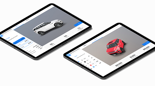
#5 Card Layouts Is a New Trend For Blogs & Digital Newspapers
First implemented in Pinterest, card layouts started to appear across multiple blogs, news websites, papers, directories, etc. They became that popular because cards present information as big separate units comfortable for visual scanning. Since they have the rectangular shape, it's pretty convenient to adjust them to fit various device screens.
Besides, card-based design follows the minimalism principle mentioned above. Cards present an opportunity to easily track users actions and promote featured content. Also, cards can get website design to a new level with expanded functionality such as hover effects, expansion, and flip over. In addition, you use card-based design to minimize the content and help a user to focus his or her attention on important things.
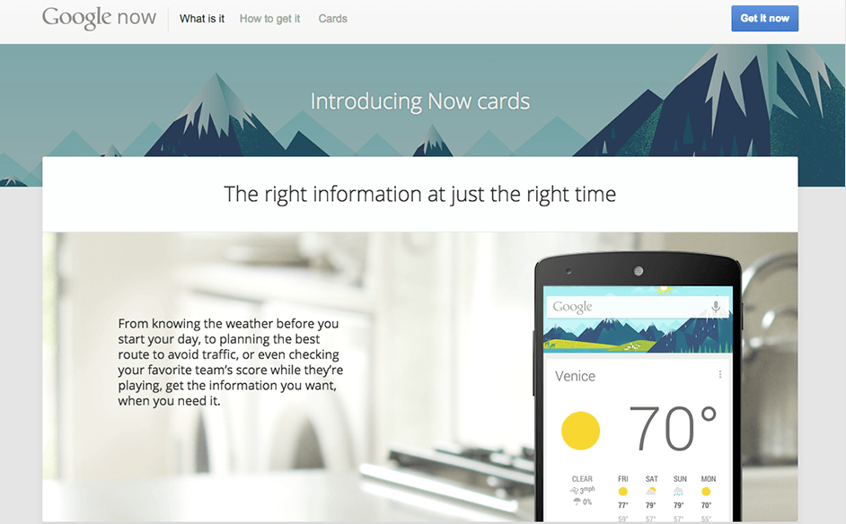
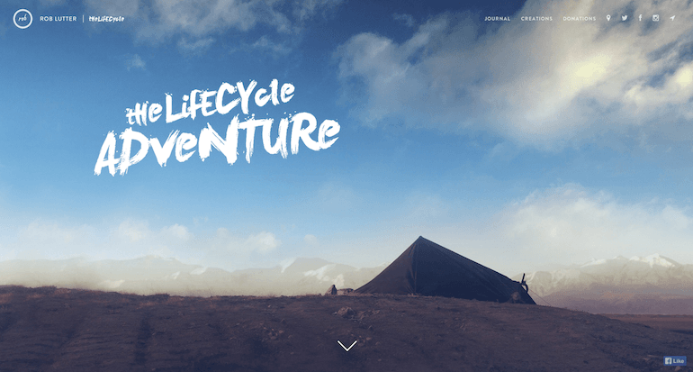
#6 A Screen-Size Image That Captures Attention
Designers in 2016 know that they should rely on the strongest human sense and place a mystical, breathtaking, fascinating, scary, beautiful or, at least, the one that makes visitors wonder full-size HD image right on the first page, since visitors like to observe pictures and videos much more than plain texts. So placing a large image is the fastest way to draw users’ attention and make them scroll down in order to find more interesting information. However, search engines prefer text content that they can easily index, so don't forget to add at least a bit of text to the image-rich pages. The most common technique is to place the HD image just above the scroll and the rest of the content locate at the bottom of it as a list of articles or use card layouts.
Nowadays, browsers can process even high-resolution images faster. So thanks to advanced technology of data distributing and compressing, the pages with heavy images can be loaded in a couple of seconds.
#7 Background Videos Is a Great Way To Introduce Your Brand
Websites with videos or animations playing in the background can create a sense of immersion into the experience you site provides and a richness of content. Such videos or animation can make your website more visible to the target audience. Moreover, the browser capacities allow users not to suffer from slow downloads.
Using such videos is a good way not only to entertain users but to introduce them to your company, your services, and products.
However, this video has a disadvantage, so you should work with them carefully because they can be very distracting and draw users’ attention away from the important content.
#8 Toying With Fonts & Typography
Since the web design market now is full of improved technology and various great trends, it's time to play with fonts. The progress makes it possible to improve the way typography looks. It can mirror your outstanding personality and be more prominent to visitors. Lately, two popular font styles are used across multiple websites: serif and handwriting.
Serif fonts are extremely popular, and a variety of business websites use them in order to mitigate the strict style of fonts, make it more user-friendly and improve legibility. In addition, serif fonts are readable on small screens.
Handwriting fonts, on the other hand, add a personal component to the websites and for that reason, they are preferred by blog authors. Handwriting lettering is very elegant and presented in headers, post titles, business cards, menus and so on.
#9 Loading Animation Keeps User Busy While He Waits
This trend migrated from quite similar mobile experience. For applications that need some time for downloading designers create loading screen that shows the download progress and kindly ask a user to wait. The similar principle web designers apply to modern websites - they place a loading animation on the front page. It's used to entertain users while the web server collects information and displays it on the web page. Users pay attention to this animation, examine it and stop thinking about downloading itself.
It's better to keep this piece of animation simple and avoid using music or video. To achieve better results, you should design this animation in a way it will correlate with your brand, color palette and style of the website. Loading animated pics are widely used with flat design.
#10 Social Comment Is a Way To Success
Although most of the content management platforms (like WordPress or Joomla) have great commenting systems, the majority of users prefer to leave comments via social networks. They consider it's easier to log in using their accounts on Facebook, Twitter, Google+, etc. instead of creating a new one in the system (even if it's just a second longer).
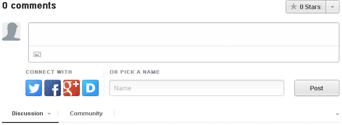
To capture social comments and encourage users to share their thoughts across their accounts, 2016 dictates web designers to integrate their websites with a social commenting system. As we’ve stated just now above this will allow you to receive a comment and to get free advertising via social accounts of your users.
#11 Unusual Navigation Can Save Up a Little Place
Hidden navigation bars gain more and more popularity because they can help to save screen space. Traditional menus are often located at the top of the page or on the left side of it. However, web designers experiment with a navigation menu and either remove it at all or hide with hover effect or use slideshows to demonstrate it.
Besides, from time to time web designers apply so-called "ghost buttons" which disappear and merge with the background when you take the cursor away from them. Usually, this trend is put into use at the websites which represent minimalistic design or are combined with flat design.
#12 Tell Your Fascinating Story And Make Users Be a Part Of It
When you pose an intrigue question to the visitor or ask a question, an answer to what he or she would like to know straight away, you switch the curiosity on in visitors' brains. So they scroll further or click on other icons in order to know more, and by the time they finish their journey, you will have ended your story as well. Moreover, your customer is happy and wants more from you so much that he or she is willing to pay.
Why did this trend become popular? Well, first of all, people love stories. They like to hear about something and then imagine what they would do if they were a character in the story. So web designers give them such opportunity to use interactive stories to introduce a company, service, brand or product to the audience.
Final Thoughts
These dozen trends that were discussed in this article today are expected to gain more popularity among web designers throughout 2016. The latest functionalities and technologies in the world of web development services are worth investing to stay in line with the tendencies. Of course, popular trends aren't the best choice for each case and you don't have to apply them to your website as soon as you finish reading. However, some of the trends can help your website to stay on top of your competitors and provide the most astonishing user experience. In addition, looking for ways to improve your website will help to increase the potential of the site and give you a lot of insights on how to push the UI and UX development trends further.
A lot of website owners are going back to the basics and focusing on simplified design and layouts. Designers feature websites with fewer elements and choose more simple architecture, quiet colors and leave more blank space. Generally, in order to facilitate the design and create a more structured and simple UI, some elements can be excluded.